Hospice
AN ICONIC SYMBOL OF CARE
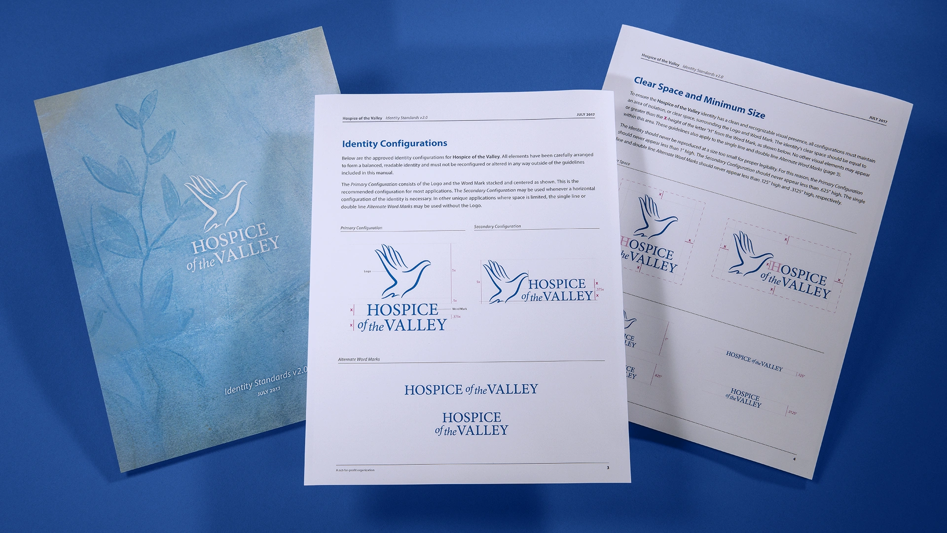
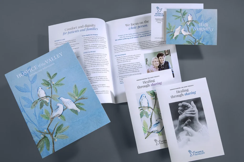
The development of the Hospice of the Valley logo illustrates how thoughtful design can distill complex emotions into a single, resonant symbol. By blending the warmth of human touch with the universal imagery of peace, the mark becomes more than a logo—it serves as a visual expression of care, comfort, and graceful transition.
WEAVING TOGETHER HUMAN COMPASSION AND SPIRITUAL PEACE
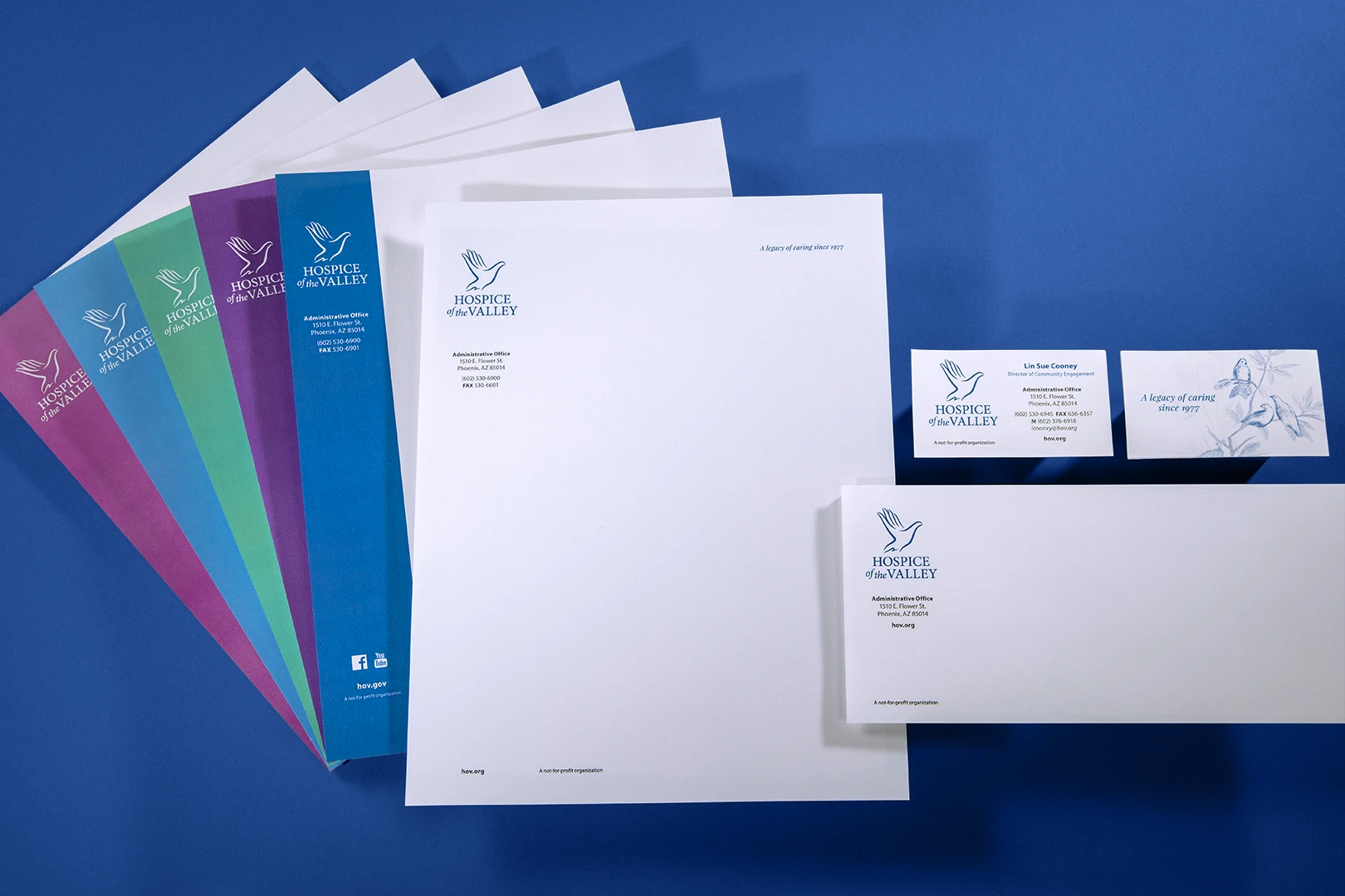
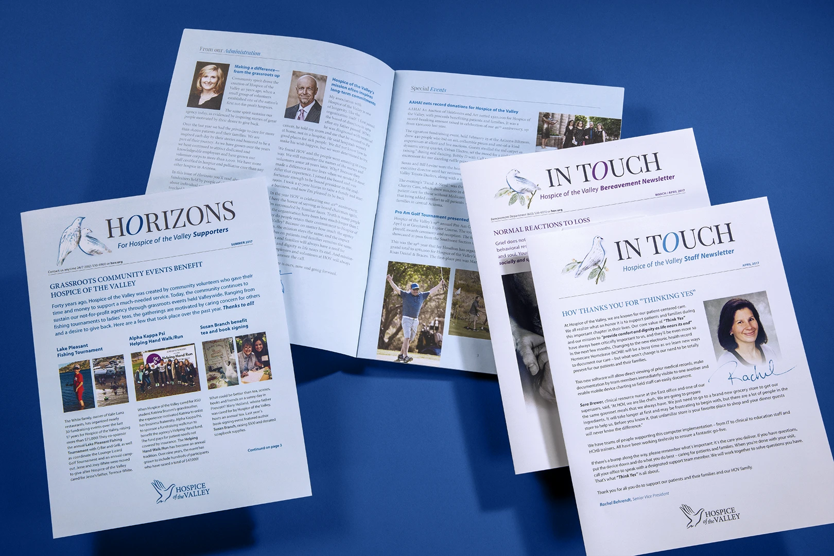
As Hospice of the Valley expanded its services and community presence, the need for a visual identity that reflected its mission of compassion, care and peace became increasingly important—one that spoke to experiences beyond clinical care and into the personal and spiritual. The resulting logo stands out in a crowded healthcare landscape, remaining instantly recognizable across brochures, websites, uniforms and vehicles.
Services
Brand Campaigns, Brand Identity, Brand Strategy, Positioning and Key Messaging, Print Marketing, Standards and Guidelines
Industry
Healthcare, Non-Profit